There’s one thing all small business owners can agree on:
Nothing compares to the rush of seeing a brand new booking on your calendar.
Just like money, bookings don’t grow on trees. Ask any business owner and they’ll tell you that securing new business doesn’t come easy: it involves hours of hard, unseen work with no guarantees of a future payoff.
The good news, however, is that you no longer have to do all the heavy lifting on your own. vcita’s new, freshly designed online scheduling tool is here to make getting discovered, booked, and paid by clients near you faster and easier than ever.
So what’s so great and special about our scheduler’s new look and feel?
We’ve invited Noa Gur, senior Product Manager and the mastermind behind vcita’s new online scheduler to give us the inside story behind the new design.
Q: Hi Noa. Very happy to have you here. For those who don’t know you, can you tell us a little bit about yourself?
Gladly. I joined vcita back in January 2020 after working as a product owner, project manager, and team leader in a few tech companies. Though I loved the work, I was itching for a role where I could have closer contact with clients. And then fate – or good fortune- propelled me to apply for a job at vcita.
What I love best about working here is that every decision I make has a direct impact on peoples’ day to day work experience. It brings new layers of urgency and responsibility to the work and pushes me to be my very best. What’s great is that this is a sentiment that the entire team shares. We’re a “client-first” company – that’s what all of us at vcita are about.
Q: What kind of work are you responsible for at vcita?
I’m responsible for planning and defining the product features under my domain. I constantly seek opportunities to improve existing behaviors and initiate new features that are aligned both with the company’s vision and with customers’ changing needs. An important part of the job is just listening to customers and other stakeholders and understanding what they want. I then work closely with product experts, designers. developers, and QA professionals to turn those needs into deliverables. It’s a dream job.
Q: What was your first reaction when you were told you were trusted with the mission of redesigning vcita’s online scheduler?
Oh wow. The online scheduler is one of vcita’s core and most popular features, so I was a little overwhelmed.
This feature may look easy but when you get a closer look under the hood it’s actually quite intricate. We have a varied audience of small business owners who don’t always share the same vision or goals. So with every step I made I had to justify first to myself – and then to the team – one work flow or one design over another.
Luckily for me, I work with many smart and knowledgeable team members who made this task a lot easier to handle. We debated over almost every pixel to make sure the experience was as optimized as possible.
Q: What was “wrong” with the old design? Did you feel a change was necessary?
The old design was not up-to-date and was built over a relatively old infrastructure. We all agreed we needed to pay more attention to users’ experience and focus on a “mobile first” approach. This, by the way, is an argument that can be made for any feature or any product – keeping your offering fresh is every Product Manager’s daily bread.
What was different, this time, was the fact we were working in the framework of a global pandemic. Consumers’ expectations changed nearly overnight, and the demand to purchase and book services online was and is still growing exponentially. It was clear to us we had to support our clients through this time by giving them the best online visibility we could offer, as quickly as we could offer it. I think our clients appreciated the quick turnaround.
Q: What were the main challenges you faced when designing the new online scheduler?
I think the main challenge was scoping. We obviously wanted to include everything and optimize each and every scheduling flow. However, in the real world, time and resources are limited and you can’t escape the sobering reality of priorities and timelines. The hardest challenge was deciding what gets to go in and what will have to wait for the next round. We needed to make sure we get everything we need, and not, necessarily, everything we want. I think the Rolling Stones have a song on that.
Q: What were the main changes you decided to make and why?
We made a big change to the services menu. The services menu is a make or break moment in consumers’ journey, where the final decision on whether to make the purchase or not is made. We invested a lot of time in re-thinking the menu and how we can push consumers further down the sales funnel. That’s why we decided to make our clients’ services more center stage by putting a new emphasis on service photos and service descriptions.
Another big change we made was to the Event invitation landing page. Before, when consumers clicked the invitation link, they were instantly redirected to fill out their info. We wanted to create a new experience that highlights the event first.
We researched many different options and eventually came up with this design, which I’m happy about.
The Payment experience was another key element we had to rethink. For a business owner, nothing feels better than having a pre-paid booking. However, paying upfront is an experience that can easily go wrong when consumers don’t feel motivated or safe enough to share their personal info. And then, of course, you get all the business owners for whom upfront payments isn’t a feasible model due to the nature of their business, their client demographic, etc.
We had to come up with ways that push paying upfront as a mandatory or optional requirement, without being too intrusive or compromising consumers’ experience. We had considerations like how to create rapport with consumers; what happens if a payment fails; when and how to introduce the option to pay upfront to the flow, and so on. Eventually, we decided to separate the payment flow into two main scenarios:
1. Upfront online payment as a mandatory step in the booking process:
2. Non-mandatory online payment as an added optional step at the end of the booking process:
I hope we made eveybody happy.
Q: What are you most excited about in the online scheduler’s new design?
I just love the new mobile experience! The new images and branding add tons of flavor and each step of the flow is easy to understand. From a consumer perspective, I think the experience is so much better than what it was before.
Q: Our clients seem to love the new design. But some are wondering whether we’ll also be adding new capabilities/features to the online scheduler. Can you share a little bit on what’s to come?
Ha. The million-dollar question!
On this round we were mainly focused on changing the scheduler’s UX, fixing old bugs, and improving flows and functionality. We did, however, add some small (but great) features like the description page, event invitation, new landing page, and have you seen the new day time filters?…
We have great plans for the next rounds like adding the ability to purchase packages and making improvements to our group events feature. And of course there are some features that I can’t really talk about just yet so stay tuned!
Thank you Noa for taking the time to walk us through the new scheduler. It’s been fun!
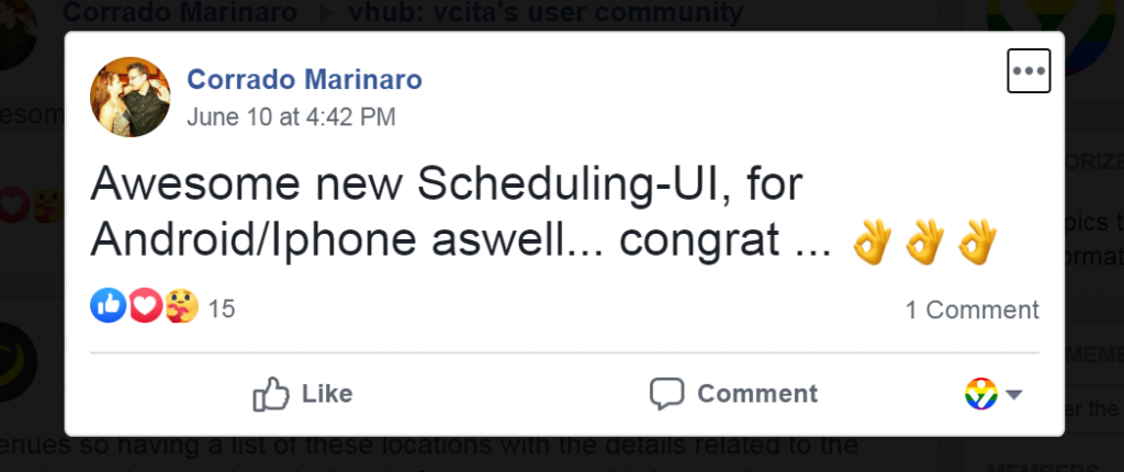
For more news and updates about upcoming features, please join vcita’s users community on Facebook.